
Table of Contents
ToggleIn a world bursting with vibrant hues and clashing colors, embracing a minimalist color palette can feel like a breath of fresh air—or maybe a refreshing sip of plain water. Picture this: a serene space where every shade whispers elegance rather than shouts for attention. Minimalism isn’t just about less; it’s about creating a harmonious environment that invites calm and clarity.
Understanding Minimalist Color Palette
A minimalist color palette embraces simplicity while prioritizing tranquility in design. This approach cultivates an atmosphere that soothes the senses and enhances visual clarity.
Definition and Key Characteristics
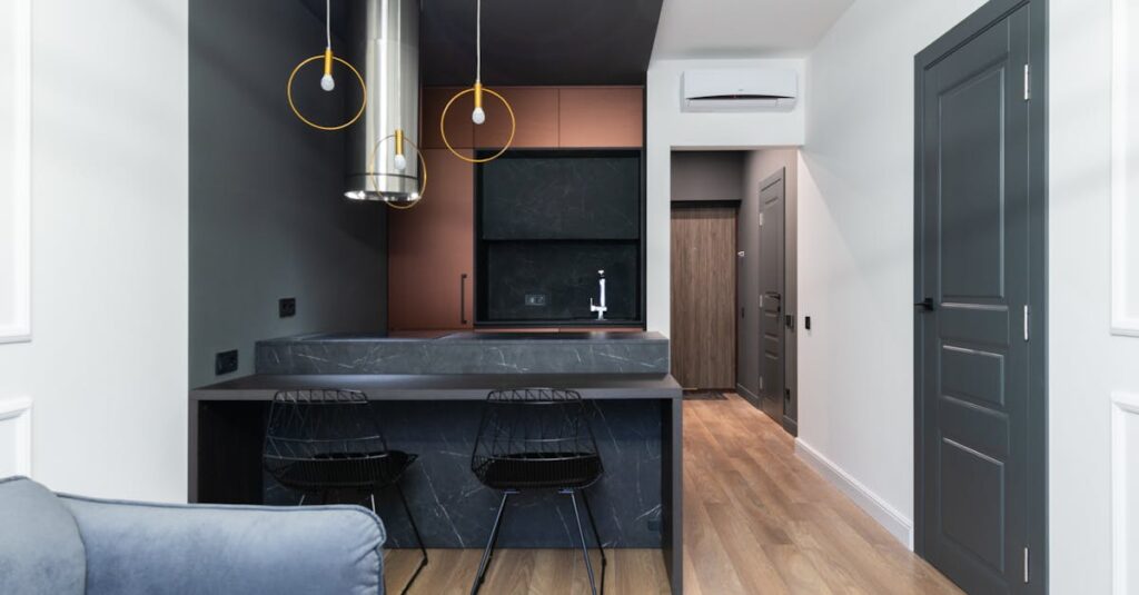
A minimalist color palette consists of a limited range of hues, typically featuring soft, neutral tones alongside occasional accent colors. Key characteristics include balance, unity, and spaciousness among selected colors. Utilizing white, gray, and beige often creates a calm background, allowing accent colors to stand out. This design philosophy avoids overwhelming combinations, focusing instead on harmony and subtle differentiation. Minimalist color selections prioritize function over form, ensuring every shade plays a role in the overall aesthetic.
Importance in Design
Minimalist color palettes hold significant importance in various design fields. In interior design, these palettes create serene environments that promote relaxation and focus. The use of gentle hues enhances the perception of space, making rooms appear larger and airier. In graphic design, minimalism simplifies visual communication, focusing on key messages without distraction. A minimalist palette directs viewers’ attention, ensuring clarity and impact. Overall, these color schemes establish a sophisticated and elegant atmosphere, proving essential in creating visually appealing spaces and products.
Benefits of Using a Minimalist Color Palette
A minimalist color palette offers numerous advantages that resonate in design, creating welcoming spaces and effective visual communication.
Enhanced Focus and Clarity
Clarity thrives in environments characterized by a minimalist color palette. Designers achieve this by reducing visual distractions, allowing important elements to capture attention. Smooth transitions between colors lead to a cohesive aesthetic, helping viewers focus on key features. Crisp whites paired with soft grays can guide the eye seamlessly throughout a space or design. Simplifying color choices also streamlines decision-making for users, making it easier to grasp important information at a glance. The result becomes a tranquil setting that nurtures concentration and productivity.
Emotional Impact
Emotional responses to colors play a significant role in design. Soft hues, common in minimalist palettes, evoke feelings of serenity and comfort. Neutral colors like beige and pale blues nurture a sense of calm, fostering positive atmospheres. Accents in warm tones can inject energy without overwhelming the senses. This balance creates inviting environments that encourage relaxation and creativity. Moreover, minimalist color schemes reduce anxiety, allowing individuals to engage more fully with their surroundings. Ultimately, the emotional impact of these palettes can transform any space into a retreat that enhances overall well-being.
Examples of Minimalist Color Palettes
Minimalist color palettes feature subtle combinations that create serene atmospheres. They often emphasize simplicity and tranquility through well-curated hues.
Popular Combinations
Soft whites paired with light grays produce an airy effect. Beige and taupe work together to establish warmth without overpowering the senses. Black accents can enhance the elegance of these palettes, adding sophistication. Earthy greens with muted pastels appeal to nature lovers by fostering a calm ambiance. Each combination draws on neutrality, balancing simplicity with subtle charm, making them versatile for various design contexts.
Industry Applications
In interior design, minimalist color palettes transform spaces into peaceful retreats. They promote relaxation while enhancing spatial perception, which can make small areas feel larger. Graphic design relies on these palettes to improve clarity by allowing essential elements to stand out. Marketing materials benefit from minimalist color schemes as they reduce distractions and convey messages effectively. Overall, their applications span various industries, reinforcing the value of simplicity and cohesion in visual communication.
Tips for Creating a Minimalist Color Palette
Creating a minimalist color palette involves strategic choices for impactful results. Each decision contributes to the overall simplicity and tranquility of the design.
Choosing the Right Colors
Select a base color that promotes a calm ambiance. Soft whites, light grays, or muted earth tones often serve as excellent foundations. Consider accent colors carefully; these should complement the primary hue without overwhelming it. Limit the palette to three to five colors for cohesion. For added depth, explore subtle variations of the chosen tones. This strategy fosters a serene and inviting atmosphere. Finalize your selections based on the intended emotions or functionalities of the space or design.
Balancing Shades and Tones
Prioritize balance when mixing shades and tones. A harmonious interplay of light and dark can create visual interest without chaos. Darker shades can add depth, while lighter shades promote openness. Assign roles within the palette; dominant colors should shine while supporting colors provide stability. Experiment with different saturations to maintain consistency. This approach encourages a layered aesthetic that enhances clarity and cohesion. Continue adjusting until the palette evokes the desired emotional response, ensuring all elements work seamlessly together.
Embracing a minimalist color palette transforms spaces and enhances emotional well-being. By prioritizing simplicity and tranquility, these palettes create harmonious environments that invite relaxation and focus. The strategic use of soft neutrals and carefully chosen accent colors fosters clarity and reduces distractions, making them ideal for both interior and graphic design.
As designers explore the versatility of minimalist color schemes, they discover endless possibilities for creating serene atmospheres. Whether it’s a calming retreat or a clear marketing message, the impact of a well-curated color palette cannot be overstated. Adopting this approach not only elevates aesthetics but also promotes a sense of peace and clarity in everyday life.